Friday 23 November 2012

Review, Refine, Relate - Final Outcome


My Best Print (Slightly Manipulated on Photoshop) - This print I feel was my best one. When I was doing these prints I had a hard time trying to capture the whites in the background and on my subjects face and at the same time trying to keep the contrasty blacks in the shadows and in her clothing. The thing that I do not like about using film is that you have to continuously use up paper and go back and forth from the machine to achieve an image that you are happy with: the upside of using digital being that you can change the settings in the palm of your hand, and if further needs to be done it can be done clearly on photoshop or on any editing programmes. However using film can be effective in refining your photography skills in more aspects, in this case: the dark room. I think that this photo was successful because, eventually, I did capture the white tones that were there somewhere. Also, the picture is well composed and pretty straight forward. I think that the composition that I have had my model doing was fairly natural and put her under no stress, making her feel more at ease and making this a nicer picture. The subject has nice eyes, and I think that I have successfully captured them and made them the main point of focus in this picture. This is done by the head light that is used to illuminate the subject, this is the glint in her eyes. I feel that this draws the viewer's attention straight towards them.  One aspect of this photo which makes it similar to the portrait artist that we are covering at the moment (David Bailey), are the shadows created by the headlight to the left of the subject. This is similar Bailey's portrait of Jack Nicholson; a portrait we studied last lesson. Another image of Bailey's which I believe this photo is similar to is his portrait of super model Naomi Campbell. I think that my photo is similar to that one of his is because of the fact there has been contrasted shadows used, however they are not as strong as the ones in the Jack Nicholson shoot. I also believe that both photos are quite natural poses and the subjects seem more at ease. I edited this photo only slightly by using the healing brush and getting rid of some smudges that were on the film (see on original print underneath). I used a magenta filter in this print as well, like I did when developing my still life photos. This made the lines int he picture more defined and contrasty. Below, I have attached an David Bailey's photo of Naomi Campbell, an original print, one with different settings and two Photoshop manipulated images. 

Settings of the Final Image: 

Photo: 
Focal Length - 35mm
Aperture - F5.6
Film IS0 - 400
Shutter Speed - 1/125

Developing for Final Print:
F Settings - F11
Timing - 05:00 seconds.
Filter? - Magenta, on, full strength.


The First Print (Not Manipulated on Photoshop) - There are several things about this photo that I was not happy about and needed further development. In this developed print there are too many dark tones which make it uneasy to look at and all in all an unattractive development of what otherwise would be a nicely composed and natural looking photograph. The settings I used in this were completely different to my final print. I used a more intense light for a shorter amount of time. In my final print I decided to opt for a less intense light for a longer amount of time. In this photo there are a few smudges also which I then went on to get rid of in photoshop for my final print. Something also about this picture which was bad was the black fringing on the top boarder. This was caused because, foolishly, I left my printing paper slightly exposed to light. This ruined all of my paper and left it with a horrible black fringe around the top. Because of this, I am going to have to use a new box of paper. This is a lesson to be learnt that I should be careful with my paper and ensure that it is not exposed to any light.

Developing the First Print:
F Setting - F8
Timing - 3 seconds
Filter? - None


My Photoshop Manipulated Images:
These two images have been tweaked slightly in CS5. The image on the right has had its levels changed, creating a more contrasty photo that seems to be more prominent on the paper. One thing that I have to be wary of about editing film photos on photoshop is that unlike when I do images and have the ability to be playing with large 14 megapixel photos, these are a very size and as such have a tendency to have banding (the strong tone differences around the subject's face).  The one on the left is more subtle, I believe, because I did not edit is as much. The only editing done on this photo was sharpening and colour balance. Both images were 'sharpened more'.

Naomi Campbell by David Bailey
http://4.bp.blogspot.com/_q08M1ajACHg/SGtYhIGOLLI/AAAAAAAACcU/qUk82rQ9bsU/s320/naomi.jpg
Links to photos including photos not included in this post: 

Posterised image - http://www.flickr.com/photos/luke_mellor/8211401394/in/photostream
Purple image - http://www.flickr.com/photos/luke_mellor/8210312865/in/photostream/
Final print - http://www.flickr.com/photos/luke_mellor/8210312999/in/photostream/
Unused image - http://www.flickr.com/photos/luke_mellor/8211401802/in/photostream/
Unused image - http://www.flickr.com/photos/luke_mellor/8211401926/in/photostream/
First print - http://www.flickr.com/photos/luke_mellor/8211402020/in/photostream/ 

Thursday 22 November 2012

Portrait Unit: David Bailey


Jack Nicholson by David Bailey
http://justtpictures.wordpress.com/2012/05/09/carla-bruni-by-michael-comte/
Analysing the photo: When looking at portraits of a similar nature, it is always important to first look at who the portrait is of, and then how it relates to the person and their personality or how they are represented. This photograph was of Jack Nicholson, a famous actor who is one of the most well paid and famous actors in Hollywood. He is well known for his roles in such films as 'The Shining', a film where he is depicted to be a murderous psychopath. I believe he was chosen for this role because of his every day type of appearance. As covered in class, we thought that Nicholson was the type of person you could walk past in the street and not look twice, if he wasn't so well known. This is probably why he was hired, emphasising that psychopaths look like every day people and it's hard to tell who is one and who isn't. He played different roles throughout his career where he has played cynical and menacing characters: for instance his role as The Joker in 'Batman'. I believe before the shoot, David Bailey thought that he could capture this dark side to an every day person. He achieved this by using selective lighting at an angle that brought emphasis to one side of his face, leaving the other completely in darkness. You can tell by this photo, that Bailey didn't want his model to dress up fancily nor do a pose that imposed some type of style. When discussing the way Nicholson facial posture in this photo, a lot of the class thought that it was one of anger. However, I have believed that ever seeing this photo when covering it in GCSE, that there was something comedic about this photo. I gathered this from the way his mouth is perched in a square shape, leading me to think that it wasn't a spontaneous pose but more of an imitation of someone or him trying to be farcical. I think the most successful thing in this photo which makes it so interesting, as stated, was the fact that the front lighting has made one side of his face in complete darkness, along side his ordinary appearance I believe that it sets across a message that 'every body has a dark side'. 


Will Smith by David Bailey
http://thebectoriousonemycareerpath.blogspot.co.uk/2010/05/david-bailey-portraits.html


Analysing David Bailey's style of portraits: I think the David Bailey's style of portraits are interesting in the fact that he likes to keep in B&W. He likes to make his photos very simplistic and as such create an underlying message to all of his photos. He can achieve an interesting vibe to his photos by using creative head lighting and making them very contrasty. One thing I've noticed, in my opinion, is that he seems to challenge the personas of celebrities by capturing them in a stereotypical light that shows their imposed idea of the general public and highlights it in a way that his subject is aware of and acknowledges. For instance, when he shot Will Smith, he made him pull at his ears and puff up his mouth like he was a monkey. Smith was well known for having large ears, and being black he had been brought up where race was a larger issue than what it is now. So I believe that highlighting these two things was powerful in the sense that it showed the celebrity was aware of the fact people had mocked him in the past and was now carefree. I think that Bailey did something similar in his shoot with actor Jack Nicholson because he showed the psychopathic character which he is normally portrayed to be, with adding the personal flare that his facial expressions suggested. 


Neil & Helena by Luke Mellor/Baker
http://www.flickr.com/photos/luke_mellor/8208045729/in/photostream/

Comparing my work to David Bailey's: In these two digital pictures, I tried to replicate a similar effect to my photos that David Bailey achieves by using different lighting and plain backgrounds. I think that the lighting has been effective in copying his style of work. When doing portraits I have to say that I prefer doing studio work like Bailey does. Most like to go outside and be inventive and 'artistique', however I much prefer the straight on plain background, dual tone type of portrait. After experimenting in this type of portraiture I grew on my last portrait session with models where I used head lighting. (attached below)
I think that studying David Bailey has been successful in growing my creative knowledge and letting me have more of an insight to my own personal style.


am Hair Salon model for catalog by Luke Mellor/Baker
http://www.flickr.com/photos/luke_mellor/8208812345/in/photostream
When looking at the the photo above the lighting that I've chosen lacks originality and creativeness. As such this doesn't make it a very interesting photo to look at and doesn't give any type of aesthetic element to it that could make it have any underlying message or meaning. This is something that David Bailey, I believe, tries to creative in his photos.

Tuesday 20 November 2012


David Bailey Analysis


Having looked at Bailey's work when I was doing my Photography GCSE, I have a rough understanding of his work - although having not looked too far into his work I have gathered information about his life and work which was not covered at GCSE level.

Name: David Royston Bailey.
Born: 2nd January 1938 - current.
Place of Birth: East End, London, England.

The photo which I have chosen to headline this post is a picture of the Kray brothers. Although Bailey is more famous of his picture of the Kray twins alone, I find this picture more interesting. The Kray twins were famous for their animosity in the British mafia scene. He is also well known for taking pictures of such famous people as Will Smith, Jimmy Nail,  The Beetles and his long range of self portraits.

The picture that i have chosen was taken in 1965. The Kray twins were infamous in the mob scene in the 1950's and 1960's. I think this photo was taken to try and capture them in a stern and imposing light, which reflects their lives as gangsters at that time.

Friday 16 November 2012

LIGHT PROJECT: Final Picture & Experiments

My final piece. In this photo I like the fact there is a lot of contrast. I achieved this by placing a filter on the enlarger. I used a magenta filter as magenta filters increase the contrast in the image, whereas the other side of the spectrum (yellow) makes the pictures less contrasty. I like this picture because of the depth of focus; the centre point being in focus and the rest not. To achieve this I used an F stop of F1.7 at 1/125. Using an aperture such as this brings the attention to the point in focus. When enlarging my picture I tried to stay at F8. The F settings on a camera and on the enlarger are different and not to be confused, however are relatable in the sense that you achieve more light using smaller numbers on both.  F8 was a dim light and setting the enlarger for 3.5 seconds proved to capture the contrasty shadows in the image and yet still maintain the light which was causing said shadows. This was my favourite photo from my set, so I chose to play around and so more experiments with this photograph. Below are the different photos I took with different settings, trying to achieve my final picture.  I have noted the different settings I used.

Filter. I used a magenta filter for this picture, as I wanted to highlight the light in the picture and yet keep the lovely contrast which the original had. I used 3.5 intensity for the filter. However it wasn't as contrasty as I would have liked.


Almost there. When I did the bottom piece, I thought that it needed a little more contrast to help highlight the dark lines I thought that it had lost. To achieve this picture I used a higher filter setting: 5. F8 for 3 seconds. 
Experimenting with different timings starting at 1 second, being used 7 times. The far left of the photo was exposed at F8 for 7 seconds without a filter, the far right has been exposed for 1 second without a filter.


Thursday 15 November 2012

Man Ray Analysis


http://www.manray.net/images/man-ray.jpg

Wikipedia Reference:
Emmanuel Radnitzky (aka Man Ray) was an American modernist artist who spent most of his career in Paris, France. Born on August 27, 1890, he was a significant contributor to the Dada and Surrealist movements, and produced major works in a variety of media but considered himself a painter above all. He was best known in the art world for his avant-garde photography, and he was a renowned fashion and portrait photographer as well as his work with photograms, which he called "rayo-graphs" in reference to himself.  http://en.wikipedia.org/wiki/Man_Ray


 Though Man Ray was a leading force in making photograms more commercial through his own work, he was not the only nor the first person to do them. Originally artists such as  Hippolyte Bayard and William Henry Fox Talbot were the founders of photography and photograms in the 1800s, Man Ray's work being done in early 1900's. 'Rayo-graphs' were photograms, and the name 'Rayo-graphs' was a figment of Man Ray's arrogance that he used in reference to his own style of photography.

How to Make Them - A Rayograph (or photogram) is made by making a print in a photolab without using a camera. By placing objects on top of a piece of light sensitive paper in the dark room, you can use an enlarger to cast light onto the paper and capture the sihouettes of the objects chosen to create an interesting 'photogram'.

A photogram is making a print in a photo lab without using a camera. By placing objects onto a piece of light sensitive paper in a darkroom, you can use an enlarger to cast light onto the paper and capture the silhouettes of the objects.

A photogram is making a print in a photo lab without using a camera. By placing objects onto a piece of light sensitive paper in a darkroom, you can use an enlarger to cast light onto the paper and capture the silhouettes of the objects.

What is needed -
Objects of your choice
Sheets of light sensitive photo paper
An enlarger
Complete darkness


Andre Kertesz Analysis


Born in Budapest in July of 1894, Kertesz was one of three brothers from a middle-class family. Soon after getting his bachelor’s degree from the Hungarian Academy of Commerce in 1912, he found a job as a clerk at the Budapest Stock Exchange. Though the work seemed far from his deeper aspirations, it did provide him with the resources to purchase his first camera. When, in 1914, he was drafted into the Austro-Hungarian army, he brought along his camera. The photographs he made during the war represent the beginnings of his formation as a serious artist. Unlike other war photographs, Kertesz’s concerned themselves with the lives of soldiers away from the fighting. Part of Kertesz’s genius was his ability to cast attention on images seemingly “unimportant.” These subtle images of the moments of joy and contemplation away from the front were a revolutionary use of the newly invented hand-held camera. - Pbs.org

Though some of Kertesz' work was fairly ordinary and didn't leave much to the imagination, he did also do work which was not as easily analysed. He dabbled in photojournalism and is considered one of the great influences for photo journalists today. Kertesz had a 'distortion period' in which he experimented with the naked female form in the reflection of a carnival mirror that extruded their features. Though he is not as well known for his distortion period in 1933, he is more famous for his still life work; though in my opinion it was his least interesting of his work.

Distortion 65.
http://www.higherpictures.com/ImageViewer.aspx?id=403  
An example of his photo journalism work. http://2.bp.blogspot.com/-lPhcduQtkQ0/TYp_x-kCA5I/AAAAAAAAAJk/pFhXJuZoS4k/s1600/kertesz.jpg


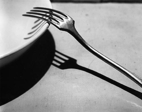
Fork.
http://blog.ricecracker.net/wp-content/uploads/2009/09/Estate_of_Andre_Kertesz_Fork_Paris_1928_1019_55.jpg

My analysis of an example of his work (Fork):
To refer back to a post I found online, an analysis of the picture, I believe that no further analysis can be made other than the photographic skill boxes that it ticks off. The post I read dumbfounded said:

An image that easily captures attention and stays long in memory. Maybe because we didn’t expect such a performance from the mundane and the taken for granted around us. Kertesz has masterly simplified here into an abstraction that take us by surprise. Maybe because we sense – reluctantly – that the fork hides so much about us. Things which reflect forms of social life and ways of individual self-discipline, entailed in the development of modern manners.

Reading this, in my personal opinion, I think that this photo is more glorified than it actually should be. This photo, I believe, is only good in the sense that it presents a good composition and the tones in the piece are strong and contrasty. This photo looks like something that you can imagine being seen hung on the walls of a coffee shop. I see nothing amazingly interesting in this picture. If this picture was done by a digital photographer in this day and age, it would be disregarded and not given any form of attention whatsoever. Perhaps people were interested by it because photographer had been a new art form when this photo was released and nothing of the sort had been seen before hand. I find his distortion work far more intriguing. 

http://www.bulgergallery.com/dynamic/images/display/Estate_of_Andre_Kertesz_Distortion_63_Paris_1933c1980_3120_41.jpg
When I first saw the distortion series by Kertesz, I immediately thought that as a man himself; Kertesz was looking at the female form in a more in depth perception. Men worship the female body, and I think that when doing this work he was trying to make the women's bodies look as lop sided and ugly as possible. Women are the ones that are on the front of Vogue Magazine, and are seen as the beautiful ones. I think in this set of photographs, Andre Kertesz was seeing an ugly side to the female physique that was perhaps underneath the clothes that men did not see. To refrain from sounding sexist at all costs, women are notorious for being controlling of men and all women know that they, in a sense, have a precedence over men because of the fact men are so in awe and confounded when faced with the naked female form. Looking more abstractly at the photographs, maybe it was being shown that underneath the clothes, the female body may be attractive to men in a siren form, it is an ugly sight when faced with something that can control men and make them helpless to only cater to the every whim that is asked of them, all if getting what's underneath the clothes is the end prize. 


Wednesday 7 November 2012

How To Use A 35mm Film Camera

There are certain settings on films which correspond to DSLR's also. They both use a single lens reflex system, and can use multiple detachable lenses. The kit lenses that are generic to come with film cameras are 35mm lenses. This is why film cameras are normally just given the name '35 mills.'

MODE DIALS:

Iso is not changeable on film cameras. You can buy different ISO films. The mode dial on the top of the film camera is for shutter speeds. A shutter speed is the speed in which the shutter opens and closes, exposing the film to light. There are different shutter speeds varying from 1/500 (1 500th of a second), 1/250, 1/125, 1/50 or even as slow at 1 (1 second). There is also something called a B setting. The B setting opens the shutter as long as you hold it down.

APERTURE:

Aperture is controlled on the lens, however on DSLR's you can control the aperture in the camera (as well as the shutter speed and ISO). By turning the aperture ring on the lens, you can control the area in focus. The smaller the number, the amount that is in focus is smaller also. You can achieve great bokeh in the background by using small apertures such as 1.4 or 1.8. The higher the aperture number, the higher the more that is in focus such as 22. These numbers are called f settings.

HOW TO ZOOM/FOCUS:

35mm lenses are called fixed focal lengths. If a lens has only one number (50mm, 80mm, 400mm) then it does not zoom.  To focus, you turn the focus ring.

HOW TO TAKE A PHOTO:

Press the shutter to take a photo > Pull the shutter lever to pull the film across.* > Press the shutter to take a photo

*To make sure that the photo has rewound properly, try pulling the lever again and if it does not wind again then it has wound properly.