Thursday 7 March 2013
Tuesday 26 February 2013
Shadows
 |
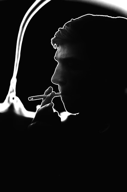
Dubble D - /500, F1.8, ISO 500, 50mm |
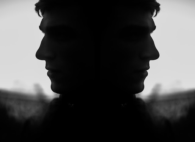 |
Dubble D - /160, F1.8, ISO 640, 50mm |
When doing a shoot for a friend's DJ page, I had the idea to do some shots with a darker side to them. These photos were taken at F1.8 on my D7000, and with the very bright sky in the background it left the background overpowering the subject and leaving him in the shadow. I had to use a low ISO to help balance out with with high F stop to compensate with the background. This could be solved with using a lower F stop, but I wanted to keep a nice dreamy blurred background. An example where I shot with a lower F stop (3.5) to bring more detail into the background is attached below:
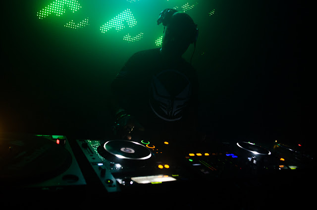 |
| DJ Q at Fire Vauxhall /10, F3.5, ISO 1250, 18mm |
Thursday 14 February 2013
Starting Points
I have three ideas that I have thought up and can say easily that I am happy with. The theme of the project is convert and obscured, so I have thought up these ideas. Each one is different to the next, and as they did not match one another I felt that I should not simply have one large linking story, but have three different ones. They are under three separate titles.
How Are You Feeling Today (Gif + Pictures) - I had the idea of 'what if you wake up every day and you could choose how you were feeling'. From this idea I felt I could expand and maybe delve into 'what if life was like a computer game, like sims, where you could select the mood you're in and choose the expression you have just by selecting accordingly. I felt that this was an interesting concept that you could perhaps start off with a blank face, a blank canvas, and select who you wanted to be for that day, and you could take it off at the end of the day and be someone completely different the next. This idea could further be linked to the nature of human beings that we can change our personalities at the snap of our fingers when in different situations. Our idiosyncrasies and are dependant on the situation we are in. This is funny because that idea juxtaposes the actual definition of idiosyncrasy: the person we are and the things we do dependent on our personality. People often say 'you change when you're around ******' which is true, people converge when around different people. So maybe this set of gifs and pictures could be seen as the change people undertake when being around certain people. I wanted to portray this idea by having five faces on a black background. The main figure in the centre of the frame would be a blank face: just a head with ears and hair. I wanted there to be four separate emotion faces around this: sad, happy, angry, surprised. This would tie in more with the first concept I described of choosing who you are today. If I were to work more on the convergence theory as you change social standing/personality dependent on situation, then I would try to portray personality traits rather than emotion in my photos. This set will be self portraits.
Haunted (Cinema-graphs) - This is going to be like a story board of a little girl being haunted by a ghost. The cinema-graphs will start off with them being really subtle, slowly turning more and more dark and twisted as they progress. I intend on having these cinema-graphs to be reminiscent on the film series 'Paranormal Activity', where slight hints of ghost activity is shown at the beginning and it turns more obvious that there is a haunting in the house as the story continues. I intend on shooting my little sister as the main subject of this series. I want to have her appearing to be followed by a ghost, with the hints of the ghost's presence becoming more and more apparent as each cinema-graph goes. For instance, I want the first one to be a door closing quickly, the middle one to be a knife standing up on end in the kitchen whilst she is making something on the other side of the room, and the last one to be the ghost's face appearing. This will be the most lengthy out of all of my ideas to produce.
Untitled (Photos) - I couldn't think of any title to go with this. The idea of what really is in the food that you buy, are you getting what you are buying? With the current Tesco horse meat fiasco still on everybody's minds I have thought to shoot packaging (tins, boxes, bottles) with products inside that are the antithesis of what it said on the label. For instance, I have had the idea to put a toy horse head in a Tesco lasagne dish, mayonnaise/ketchup coming out of a Febreze bottle or perhaps a baked beans can with a straw and cocktail umbrella coming out. These are pretty wacky ideas, and are supposed to be a surreal look at the things we purchase. For a further understanding on what I would like to achieve and what I mean, take a look at this website showing some interesting examples of cinema-graphs. http://cinemagraphs.com/
Tuesday 12 February 2013
Rankin
 |
John Rankin Waddell, born 1966, is a contemporary fashion and portrait photographer. Born and brought up in St Albans, Waddell uses the work name 'Rankin' for his photo and video work. His original interests faltered during his time at University of Falmouth, as he decided he wanted to peruse a life of photography, he joined the London College of Printing. Since forming his first magazine 'Dazed & Confused' with friend Jefferson Hack, the Hertfordshire born photographer has founded several magazines and established his name firmly in the photographic timeline, being able to say to say he has taken photos of may celebrities such as Kate Moss, Queen Elizabeth II, Dizzee Rascal and many more. |
+Rankin.jpeg) |
Upon seeing this photo for the first time I immediately thought back to an artist I admire and have studied before: David Bailey. I think in this photo Rankin has tried to evoke emotion from the subject, rap artist Dizzee Rascal, by having him perform a vulgar gesture towards the camera. I have said several times that I admire Bailey's work and would like to peruse my portrait work in a similar way to which he has. I believe perhaps Rankin has tried to replicate his work to an extent that he tried to incorporate the simplistic background allowing large amounts of negative space. This allows the viewer to be draw straight to the subject without being distracted by anything. Also, Bailey is famous for showing a lot of emotion in his photographs, Rankin has done this in his photo. One thing that is vastly different from first sight from Rankin and Bailey's work is that obviously Bailey worked predominately with black and white and Rankin shoots more colour, though there is plenty of monochromatic work amongst his portfolio also. |
 |
This photo is one I like, despite the fact I am not personally into the excessive make up when it comes to photo shoots; in fact I am very against it. I believe there is something quite fake about having the model wear excessive amounts of make up and in this case face paint and long fake eye lashes. However in fashion photography is is very rare not to see a model caked in loads of make up. It is rare I will find a photo like this interesting. However, what Rankin has done in this photo with the face paint I believe has proved to be effective purely for the fact the background is black. If the background was white, I would be less inclined to like this photo. The subject pops out of the background, and if I am right, I assume Rankin has tried to make her look almost like a demon - with a very slight chinese/japanese tint to the photo. I say this because I feel the subject reminds me of these chinese/japanese demons you see in fairy tails and comic books. One thing I'm not completely sure of is why the subject is wearing a black/dark navy beanie. I believe this detracts slightly from what otherwise would be a very powerful image. |
DESTROY
Rankin's Destroy was a project he underwent where he asked the subjects of his portraits to 'destroy' the photograph he takes of them. In this way he asks his subject to portray themselves in any way that they choose fit. The whole project was in partnership with and in celebration of the Youth Music Week. Ranking had his fair share of celebrities in the music world to shoot: ranging from Little Boots to Alex Zane, Andre 3000, Example and Florence and the Machine. All of the shoots were printed off and sold as original prints at auction. The photos were also printed off in a book and these books can still be bought online today, 4 years after the project. The idea of the project was to make money for Youth Music and raising money to give support to those who needed it. When seeing the original photos from each shoot it became apparent that Rankin went for as basic photos as possible, I suppose it was in this way that the music artists were given more space to be creative. One thing about the photos is that Rankin probably could have used them in his own portfolio before they were 'destroyed', as I feel that they were powerful images to start off with. Rankin uses very creative lighting when doing his photoshoots. One of my favourite images of his where he used a strong headlight to illuminate the front of the subject's face, is his photo of singer songwriter Seal.
I love this type of lighting that hits the subject's face leaving a lot of the negative space completely black. When I first saw this project I was unaware of the fact it was done by the Youth Music Project. I firstly felt that the photos could have many different meanings to them. I felt that it may have had something linking in with the fact it was paired up with a youth project. Perhaps the artists who destroyed their portraits were trying to revert back to a childish state where they have more artistic creativeness. That's quite a bold thing to say considering the are famous for their creativeness and individuality as celebrities. However I felt that perhaps by reverting back to a childish state they were able to capture some type of imagination that they had as children and allowed them to make more interesting and 'in your face' images. This was true in part, but when I read up and watched some interviews with Rankin himself, I saw that he was trying to capture the hidden personalities of the musicians. Rankin explained that there was a massive fabricated lie that the media seems to portray of musicians and we are forced to believe these lies because it's all we really see of them. By this project, Rankin was trying to make the subject's express what they felt and show people what they were like as an actual person. Rankin said himself he was lucky enough to choose from a variety of his own favourite artists. We experimented in class with doing something similar. We took photos of ourselves on the Macs and then destroyed them by any means we felt right.
I love this type of lighting that hits the subject's face leaving a lot of the negative space completely black. When I first saw this project I was unaware of the fact it was done by the Youth Music Project. I firstly felt that the photos could have many different meanings to them. I felt that it may have had something linking in with the fact it was paired up with a youth project. Perhaps the artists who destroyed their portraits were trying to revert back to a childish state where they have more artistic creativeness. That's quite a bold thing to say considering the are famous for their creativeness and individuality as celebrities. However I felt that perhaps by reverting back to a childish state they were able to capture some type of imagination that they had as children and allowed them to make more interesting and 'in your face' images. This was true in part, but when I read up and watched some interviews with Rankin himself, I saw that he was trying to capture the hidden personalities of the musicians. Rankin explained that there was a massive fabricated lie that the media seems to portray of musicians and we are forced to believe these lies because it's all we really see of them. By this project, Rankin was trying to make the subject's express what they felt and show people what they were like as an actual person. Rankin said himself he was lucky enough to choose from a variety of his own favourite artists. We experimented in class with doing something similar. We took photos of ourselves on the Macs and then destroyed them by any means we felt right.
Monday 4 February 2013
FINAL EVALUATION
 |
| One of my favourite photos chosen from my final outcome. |
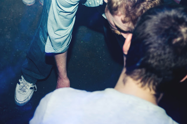
In my brief I decided to cover the theme of Light. Before I was more interested in doing portraiture as it was something I hadn't really covered before in my personal work and it was something I had enjoyed when doing it in class. I felt that it would be beneficial for my personal skills and portfolio for me to experiment with more portraits, which I did. However after looking through some of the photos I had, I was unhappy with the way they had come out. I was being urged to photoshop some of them to show my skill in photoshop as well as with the camera itself. However after photoshopping some images I grew unhappy with the photos I had taken. And one strict rule I follow myself is that nobody's opinion matters more than your own. So I decided to drop portraiture and do something I was more used to: club photography. I felt it would be perfect to do club photography as my final project as it is something I'm comfortable with, and something I do regularly. Something I like particularly with club photography is the vibrance and passion that is on some people's faces that I don't think I would be able to replicate by asking a model to show those emotions, even if I tried. There's something quite amazing about the love drugged intoxicated teens and adults dancing under a light flooded dance floor, enjoying the music and showing their passion through physical displays. I notice, when shooting club nights, there are often people hugging one another for no apparent reason and people kissing those they have just met. There is nothing more interesting, photographically, than sudden urges of emotion that along side slow shutter speed light trails can create powerful emotion filled photographs. The faces are also some things I love the most. You get some brilliant expressions on people's faces, whether it be because of genuine happiness or delirious daze induced by the alcohol consumed. I felt myself lucky having covered light photographers such as Patrick Rochon who focused all of their work around long exposure light trails, creating passionate explosions of colour and vibrance. This is something I always try to recreate when shooting in a club. The strobes and lighting systems can create strong beams of light that storm into frame and when using low ISOs and a flash gun, create light trails rather than filling the whole photo with a solid colour. I also attempt to use aspects of photographers such as Jesse Olu, Laurence Howe and Tom Horton's work to find my own style. However after finding a style I am happy with, I feel that my work is different to all three's, and in itself is unique. I feel that there's always ways, however, to improve my final outcomes when working at clubs. I always come away liking my photos, however I also always think there's something I wish I could have done to improve. The photos I have submitted for my final outcome were used with my 50mm F1.8G. This lens is relatively fast and good for it's manual override drive focus, but it is totally terrible for club work. It's just too tight. Sometimes I feel it can be good for getting a busy vibe, by making it look like there's no room to take photos, because there are too many people, but on the whole it can be a nuisance to use it in a club where large groups of people want photos, and 50mm just can't hack it. I recently shot Trolley Snatcha, Zomboy, Coki and True Tiger at Cable Nightclub for an album launch night, and I used my kit lens: the 18-55mm f3.5-5.6 VR. This lens is very slow and has no manual override. However when using it with auto focus assist light at 18mm, it is useable and I can't deny it. However it isn't sharp, even when shooting in RAW. Other than perhaps buying a new, faster and sharper lens, I can't think of anything that I would change about my work. I am very happy with my current style and I feel that my outcome reflects it. I just need to carry on with my work, shoot as many events as I can and enjoy myself. I believe that the photos that I have chosen show that I enjoy the work that I do and that I can capture the emotion that I desire to capture, with stunning colour and contrast.
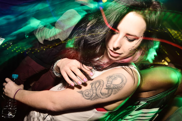 |
| A photo shot with my 18-55. The 18mm focal length allows me to get closer to people and use different flash angles and intensities. It also allows me to get more in the frame. |
Wednesday 30 January 2013
 |
| F4 / 1 second / ISO 400 / 50mm |
After reviewing my portraits, I came to the decision that I would not want it as my final outcome. After doing multiple club jobs, I have become more skilled in this area. The elongated light trails that are reminiscent of light painting photographers such as Patrick Rochon, bright colours, negative spaces and candid nature that are captured in my photography, I believe are more aesthetically pleasing than any portrait. I feel that my photography captures the vibrance of the club, which is what my clients like to see. Being aware of this, I try to use slow shutter speeds to create light trails from the strobes that the lighting systems produce.
 |
| F4 / 2 seconds / ISO 400 / 50mm |
One thing I like doing is capturing single people, something that I seem to be forced to do when using a 50mm in a tight space. Capturing one person, with a low iso, creates a large amount of negative space. Negative space is the dark areas that are empty. Something I try to pride myself on is my composition. So I like to keep the subject in the middle of the frame and have a large amount of light entering the picture, but at the same time having a lot of empty space. There are other photographers that I try to not replicate but incorporate some aspects of their style in my work.
 |
| Tom Horton Photography Tom-Horton.co.uk |
 |
| F4 / 1 second / ISO 400 - 50mm |
This is photographer Tom Horton, a photographer whose style I admire greatly. I like the fact he can get in close with his subjects and capture their skin tones perfectly even when using slower shutter speeds. I think that he is very good at capturing the moment, which is something I have tried to replicate in the photo below. I'm currently happy with the settings I use, however to replicate what he does, I would have to probably buy a more expensive camera and an expensive fast focusing lens with a smaller focal length. I do not feel my 50mm is suitable for club work, however the manual override makes it good to use when wanting to capture the moment.
Friday 25 January 2013
Thursday 17 January 2013
Photo Mood Board
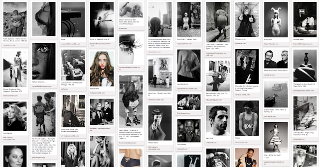
These are a brief selection of some of my favourite portraits at the moment. The photographer I have used most in this set is Conner Allen, an American photographer who is not so well known, however I am very attracted to his work. Other photographers include Kai (Digital Rev), David Bailey and Laurence Howe, a friend of mine whose photos I admire. Laurence does mainly club work, like me, however he does amazing portraits also. It's important to experiment with photography, and not stick to just one genre. Though I like doing club photography I am always eager to take photos of the interesting things I think up, whether it be an interesting landscape I've walked past, architecture or street portraits. This is one of the reasons I chose to expand on portraiture in this unit, because I had not taken many portraits before and I wanted to expand my photographic knowledge and experience by being a fish out of water. We were all told to do a task, each different which appealed to us most. Though this was a project to show our development, in my opinion it is teaching us all to try something new and trying things you've not tried before. Others have stuck to using film and carrying on the subjects that they have done before hand, however I felt it was important to do something I was less experienced in, developing my photographs and finding a final outcome I was happy with. Photography is different to every person, like all art forms, and every person's style is not the same as the next's. I, a club photographer mainly, felt I needed to take a step out of my comfort zone and experiment with portraits so I could perfect my photography skills. I am confident with my camera use, I can use manual mode effectively to any environment with my D7000, I have had models willing to let me take photos of them, one thing that I struggle with with portraiture is finding the underlying pragmatics that each photographer thinks of before or when taking the photo.
 |
| http://www.flickr.com/photos/connerallenphotography/8075675231/in/photostream |
Wednesday 9 January 2013
Portrait Editing Stages
These are some edits of a photo I took of my friend Ben. I have used a skull image I found on Google images to layer ontop of his face, and did the same with the silhouettes of some flying birds in the background to help fill out a fairly empty background. I also saturated the image and used some blue/green colour tones.
 |
| Why I wanted to change this primary edit: I felt that it wasn't contrast-y enough and it wasn't eye catching. Though this was a photo of skull imposed onto the subject's face, the image of death, I felt that it wasn't strong enough on his face. In the image above I had only pasted the skull image on and cut around the edges so it fit nicely on the subject's face. To make sure you could see his facial features properly I adjusted the layer fill before merging layers. I went on to edit this in the next picture by using the burn tool to put more of a dark tone to the shadows. Something I felt that was an issue in the was the birds in the background. When I did this shoot I was shooting at F1.8, so the rest of the background should have been completely out of the focus. When I edited the birds on in the background I didn't notice that they were too sharp and not blurred enough, totally juxtaposing the fast aperture I was using. When I edited the picture, I used the blur tool on Photoshop CS6 at home to make the birds less in focus. |
 |
| Why I wanted to change this secondary edit: Though I like this edit, I felt that even though I had edited the contrast and lightness of this picture, the subject doesn't pop out at the screen enough. To do this in the photo below I used the burn tool further to add more contrast to the shadows in his coat and further more on the subject's face. Concerning the face, I also felt that his face wasn't pale enough considering it was a skull on his face, and bone is supposed to be white, which in this edit it isn't. So by using the dodge tool I went to brush around his facial features to give a nicer ivory bone tone to recreate the bone. In the next edit I went on to further blur out the birds in the background to make them blend in more with the sky. This edit was one of the more subtle changes I made to the picture. |
 |
| Final Edit: http://www.flickr.com/photos/luke_mellor/8364125443/sizes/l/in/set-72157632170006497/ High Quality 5440 x 3776 I like using Flickr because you can download the full size files of your photos, something I find very helpful. This is my final edit of the photo. |
Subscribe to:
Posts (Atom)


