Wednesday 30 January 2013

F4 / 1 second / ISO 400 / 50mm 
After reviewing my portraits, I came to the decision that I would not want it as my final outcome. After doing multiple club jobs, I have become more skilled in this area. The elongated light trails that are reminiscent of light painting photographers such as Patrick Rochon, bright colours, negative spaces and candid nature that are captured in my photography, I believe are more aesthetically pleasing than any portrait. I feel that my photography captures the vibrance of the club, which is what my clients like to see. Being aware of this, I try to use slow shutter speeds to create light trails from the strobes that the lighting systems produce. 

F4 / 2 seconds / ISO 400 / 50mm
One thing I like doing is capturing single people,  something that I seem to be forced to do when using a 50mm in a tight space. Capturing one person, with a low iso, creates a large amount of negative space. Negative space is the dark areas that are empty. Something I try to pride myself on is my composition. So I like to keep the subject in the middle of the frame and have a large amount of light entering the picture, but at the same time having a lot of empty space. There are other photographers that I try to not replicate but incorporate some aspects of their style in my work. 

Tom Horton Photography
Tom-Horton.co.uk
F4 / 1 second / ISO 400 - 50mm 
This is photographer Tom Horton, a photographer whose style I admire greatly. I like the fact he can get in close with his subjects and capture their skin tones perfectly even when using slower shutter speeds. I think that he is very good at capturing the moment, which is something I have tried to replicate in the photo below. I'm currently happy with the settings I use, however to replicate what he does, I would have to probably buy a more expensive camera and an expensive fast focusing lens with a smaller focal length. I do not feel my 50mm is suitable for club work, however the manual override makes it good to use when wanting to capture the moment. 

Thursday 17 January 2013

Photo Mood Board


These are a brief selection of some of my favourite portraits at the moment. The photographer I have used most in this set is Conner Allen, an American photographer who is not so well known, however I am very attracted to his work. Other photographers include Kai (Digital Rev), David Bailey and Laurence Howe, a friend of mine whose photos I admire. Laurence does mainly club work, like me, however he does amazing portraits also. It's important to experiment with photography, and not stick to just one genre. Though I like doing club photography I am always eager to take photos of the interesting things I think up, whether it be an interesting landscape I've walked past, architecture or street portraits. This is one of the reasons I chose to expand on portraiture in this unit, because I had not taken many portraits before and I wanted to expand my photographic knowledge and experience by being a fish out of water. We were all told to do a task, each different which appealed to us most. Though this was a project to show our development, in my opinion it is teaching us all to try something new and trying things you've not tried before. Others have stuck to using film and carrying on the subjects that they have done before hand, however I felt it was important to do something I was less experienced in, developing my photographs and finding a final outcome I was happy with. Photography is different to every person, like all art forms, and every person's style is not the same as the next's. I, a club photographer mainly, felt I needed to take a step out of my comfort zone and experiment with portraits so I could perfect my photography skills. I am confident with my camera use, I can use manual mode effectively to any environment with my D7000, I have had models willing to let me take photos of them, one thing that I struggle with with portraiture is finding the underlying pragmatics that each photographer thinks of before or when taking the photo.

http://www.flickr.com/photos/connerallenphotography/8075675231/in/photostream
To use the photographer Conner Allen, a Nikon user like myself, in this photo he has incorporated a kind of retro theme in this photograph. This has probably been intensified by making it black and white. From looking at this photo, the most aesthetically prominent feature is the strong lines on the model's blouse that blend into her reflection. Something I like in this piece especially is the eye that peers over the shades that model is wearing, it is a small detail that is powerful in this image. To focus more on the props in this piece, I like the glasses she is wearing. I believe that using what she is wearing in combination brings a 'Breakfast at Tiffany's'/Twiggy-esque vibe to the piece, further proven by the fact she looks like she is sitting in a booth at a cafe. 

Wednesday 9 January 2013

Portrait Editing Stages

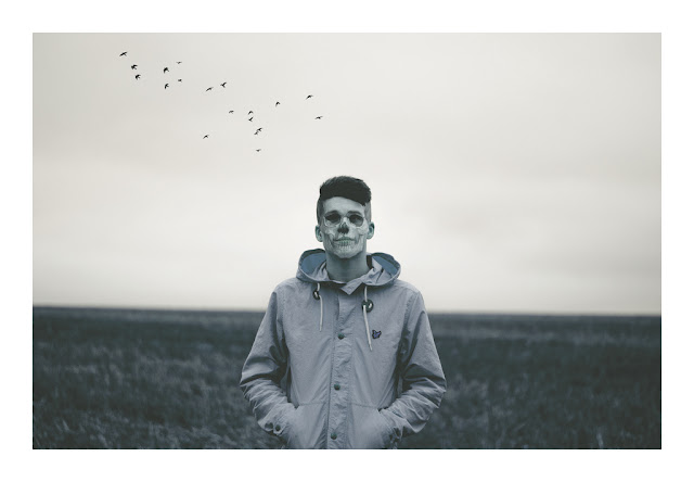
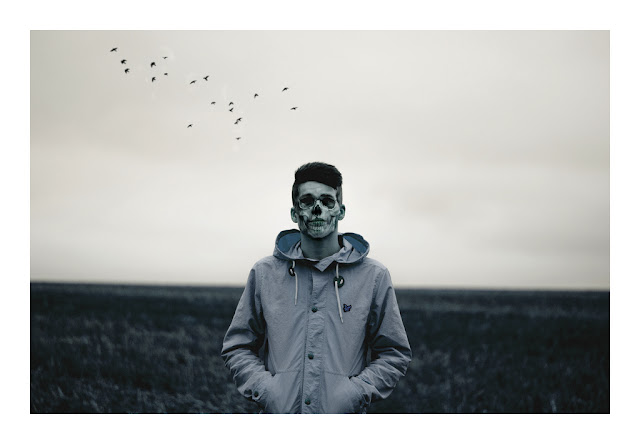
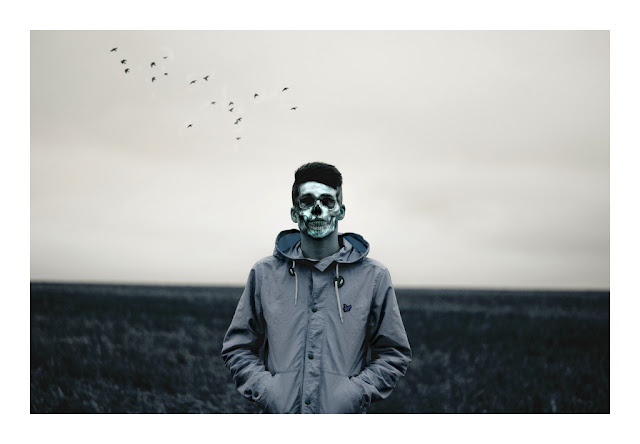
These are some edits of a photo I took of my friend Ben. I have used a skull image I found on Google images to layer ontop of his face, and did the same with the silhouettes of some flying birds in the background to help fill out a fairly empty background. I also saturated the image and used some blue/green colour tones.
Why I wanted to change this primary edit: 
I felt that it wasn't contrast-y enough and it wasn't eye catching.
Though this was a photo of skull imposed onto the subject's face, the image of death, I felt that it wasn't strong enough on his face. In the image above I had only pasted the skull image on and cut around the edges so it fit nicely on the subject's face. To make sure you could see his facial features properly  I adjusted the layer fill before merging layers. I went on to edit this in the next picture by using the burn tool to put more of a dark tone to the shadows.
Something I felt that was an issue in the was the birds in the background. When I did this shoot I was shooting at F1.8, so the rest of the background should have been completely out of the focus. When I  edited the birds on in the background I didn't notice that they were too sharp and not blurred enough, totally juxtaposing the fast aperture I was using. When I edited the picture, I used the blur tool on Photoshop CS6 at home to make the birds less in focus. 
Why I wanted to change this secondary edit:

Though I like this edit, I felt that even though I had edited the contrast and lightness of this picture, the subject doesn't pop out at the screen enough. To do this in the photo below I used the burn tool further to add more contrast to the shadows in his coat and further more on the subject's face. Concerning the face, I also felt that his face wasn't pale enough considering it was a skull on his face, and bone is supposed to be white, which in this edit it isn't. So by using the dodge tool I went to brush around his facial features to give a nicer ivory bone tone to recreate the bone.
In the next edit I went on to further blur out the birds in the background to make them blend in more with the sky. This edit was one of the more subtle changes I made to the picture.
Final Edit:

http://www.flickr.com/photos/luke_mellor/8364125443/sizes/l/in/set-72157632170006497/
High Quality 5440 x 3776
I like using Flickr because you can download the full size files of your photos, something I find very helpful.

This is my final edit of the photo.