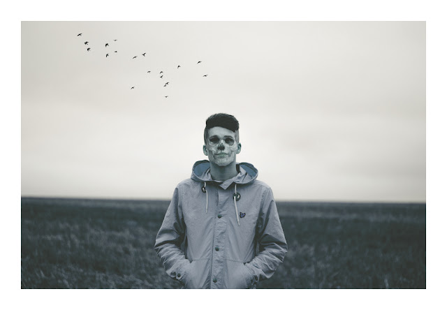
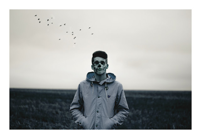
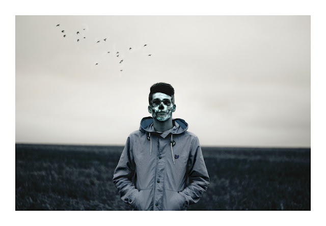
These are some edits of a photo I took of my friend Ben. I have used a skull image I found on Google images to layer ontop of his face, and did the same with the silhouettes of some flying birds in the background to help fill out a fairly empty background. I also saturated the image and used some blue/green colour tones.
 |
Why I wanted to change this primary edit:
I felt that it wasn't contrast-y enough and it wasn't eye catching.
Though this was a photo of skull imposed onto the subject's face, the image of death, I felt that it wasn't strong enough on his face. In the image above I had only pasted the skull image on and cut around the edges so it fit nicely on the subject's face. To make sure you could see his facial features properly I adjusted the layer fill before merging layers. I went on to edit this in the next picture by using the burn tool to put more of a dark tone to the shadows.
Something I felt that was an issue in the was the birds in the background. When I did this shoot I was shooting at F1.8, so the rest of the background should have been completely out of the focus. When I edited the birds on in the background I didn't notice that they were too sharp and not blurred enough, totally juxtaposing the fast aperture I was using. When I edited the picture, I used the blur tool on Photoshop CS6 at home to make the birds less in focus. |
 |
Why I wanted to change this secondary edit:
Though I like this edit, I felt that even though I had edited the contrast and lightness of this picture, the subject doesn't pop out at the screen enough. To do this in the photo below I used the burn tool further to add more contrast to the shadows in his coat and further more on the subject's face. Concerning the face, I also felt that his face wasn't pale enough considering it was a skull on his face, and bone is supposed to be white, which in this edit it isn't. So by using the dodge tool I went to brush around his facial features to give a nicer ivory bone tone to recreate the bone.
In the next edit I went on to further blur out the birds in the background to make them blend in more with the sky. This edit was one of the more subtle changes I made to the picture. |
 |
Final Edit:
http://www.flickr.com/photos/luke_mellor/8364125443/sizes/l/in/set-72157632170006497/
High Quality 5440 x 3776
I like using Flickr because you can download the full size files of your photos, something I find very helpful.
This is my final edit of the photo. |


It is a pleasure to view this blog Luke, really well done. It shows you are enjoying your subject and you have a passion for it. The annotation goes beyond the purely technical and you are talking about the potentials and limitations of each piece. Each stage is recorded and I can see experimentation and development. Please keep it up.
ReplyDeleteI would love to see the pace continue. Continue to experiment, maybe with using the club pictures, the lights and energy and create montages that express those places.